The contours of the plot posed a challenge when designing this 101-apartment residential building in Kop Zuidas. In order to move away from forced floor plans in dark blocks, diederendirrix made a radical intervention – a large cut through the middle of the building volume introduces both daylight and nature.
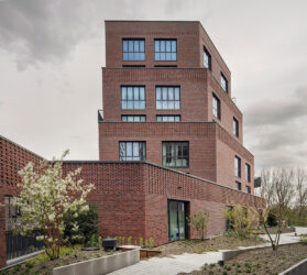
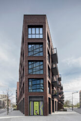
Diederendirrix was asked by developer COD to create a design for an apartment complex in the unoccupied sector of Kop Zuidas. The location, with a sharp point and tricky contours, proved to be something of a puzzle. However, by shortening the point and cutting straight through the building volume, the hermetic shape has been broken open. The effect is spectacular – the outline shifts from a straightjacket to something more relaxed and playful that adds a greener living environment to the otherwise stony Zuidas. The design was supported by both the client and the Municipality of Amsterdam all the way through, from the very outset to the end, without major interim changes.
Semi-public roof garden
The section, which gives the apartments a two-sided orientation, does not extend as far as the ground floor and instead ends above the plinth. Here, work has been carried out in close collaboration with landscape architects Felixx to create a green world in the form of a raised courtyard or roof garden, which, thanks to a wide external stone staircase, connects to the public green space planned for the other part of the plot (L2). Green is a central theme to the project. By involving a landscape agency in the plans from the very outset, we’ve been able to give biodiversity a boost with high-quality greenery and water-retardant green areas. In order to maintain the high quality of the carefully chosen vegetation, it will be managed collectively.
Graduated terraces
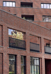
The ecological approach is being carried through to the terraces that are being created along the periphery of the inner courtyard. Here, the façades recede by one metre with every one or two floors. The graduated terraces not only create space for a cascade of greenery, but allow in ample light as well. The intensity of the light is enhanced by almost floor-to-ceiling windows. The solar panels on the roof and heat and cold storage ensure that as much sustainable energy as possible is available.
Two worlds
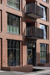
The architecture has created two worlds that ‘play’ with the contrast that exists between hard and soft. From the outside, you see a sculptural, modernist building with tight lines. Structured red brickwork and industrial windows with sleek aluminium frames and rods lend the building a sturdy appearance. At the same time, the building also gives those on the outside a glimpse inside, into a much softer and greener inner world that appeals to the imagination.
Project details - Project location
- Amsterdam
- Start date
- March 2019
- End date
- December 2023
- Client
- COD
- Client category
- Commercial
- Dimensions
- 12010 m2
- Programmes
- Living
- Typologies
- Apartments
- Disciplines
- Architecture
- Type of contract
- New building
- Project partner(s)
- Felixx landscape architects & planners
- Photography
- Frank Hanswijk
- Team
- Timo Keulen Christopher Ho Paul Diederen Tom Kuipers André Wijnhoven


